There is a growing social awareness of the importance of data in all fields. In fact, data are being used as indicators or grounds to achieve goals in all areas related to our lives, such as politics, society, economy, culture, and science and technology. As we entered the information age, data collection became easier, and more detailed data began to be collected. The concept of “Big Data,” which means data ranging from tens of terabytes to several petabytes, has emerged beyond the acceptable limits of commonly used data collection, management, and processing software.
Big data refers to a large amount of data that is difficult to collect, store, analyze, and process. The development of technologies to deal with big data, which is characterized by the generation, collection, analysis, and expression of various types of large-scale data, helps to more accurately predict the diversified modern society. With the development of this technology, it has become possible to provide, manage, and analyze customized information for each member of a personalized society.
However, the core of big data technology depends not on how much data you have but on how to use the collected big data. Just as information that everyone knows is not information, the simple listing or collection of data itself does not mean much.
Technology to Value Big Data
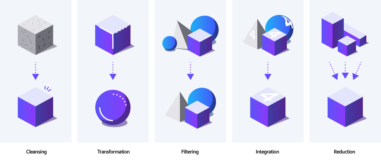
How can we use Big Data well? In order to add value to big data, it must first go through two stages: data preprocessing and data visualization. Data preprocessing is technology necessary for the process from the data processing stage of technically collecting and refining data to data analysis using analysis techniques. It is a process of processing a vast amount of raw data in a form suitable for the purpose of analysis and the method of analysis.
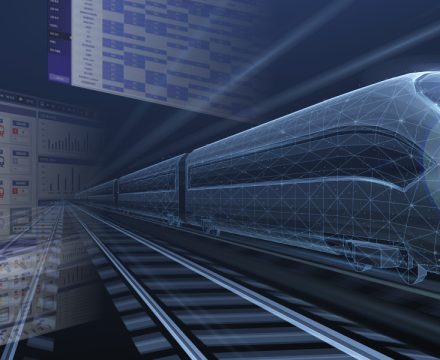
As part of the condition based maintenance (CBM) system of railway vehicles, Hyundai Rotem is developing a platform for real-time diagnosis and prediction of failures of trains and parts by analyzing various big data collected from railway vehicles. In addition, based on big data management technology using big data collection, preprocessing, and analysis technology, a demo version of the hydrogen integrated control system using digital twin technology using real-time operation and failure data of hydrogen-electric trams and hydrogen charging facilities was introduced at the Busan International Railways and Logistics Exhibition in 2021. A representative example of providing insights by combining visualization technology at the user level after refining the collected big data according to the purpose is big data utilization technology.
Learn more about “Hyundai Rotem’s Big Data Preprocessing Technology”
https://tech.hyundai-rotem.com/en/digital/hyundai-rotems-big-data-preprocessing-technology/
What is Data Visualization?
Data visualization technology refers to a technology that visually expresses and delivers the analysis result of the collected big data so that it can be easily understood. The reason why data visualization is emerging as an important element of big data technology is related to human cognitive processing. Humans are more familiar with visual information than any other sense, and about 80% of information is obtained through sight. In addition, the fact that visualized data has a higher density of information and less time and space constraints than auditory data also supports the usefulness of data visualization
When it comes to data visualization, it is easy to think of forms such as charts or graphs. Although this form is also an example of data visualization, recent data visualization has taken on a more advanced form. This is because there is a limit to expressing the collected data in charts or graphs as unstructured data such as images and images appear beyond the form of formal letters or numbers. In other words, the concept of data visualization is gradually changing from the existing meaning of expressing data in charts or tables to the meaning of technology that organizes unstructured data that cannot be understood by humans in an understandable form.
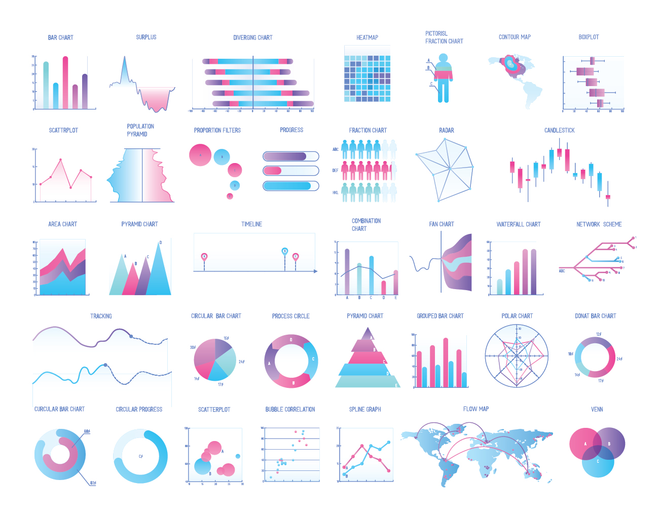
There are various types of data visualization. They can make it easier to find and understand what the data means. Typical types include Bar charts, Line charts, Area charts, Donut charts, Scatter plots, Bubble charts, Radar charts, Frame diagrams, Funnel plots, and Gantt charts.
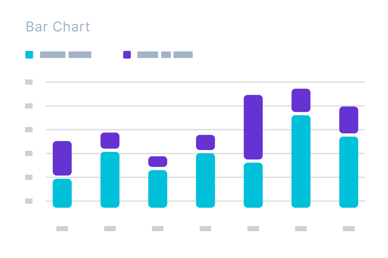
The bar chart has the advantage of representing data as a bar and making it easier to compare the numerical values of various items as a whole. Since the human eyes are sensitive to height differences, it can be useful when comparing the highest and lowest prices of data, but there is a disadvantage in expressing the characteristics of data when classification increases. The line chart represents data with points on the coordinate axis and connects these points to visualize data so that data changes over time can be linearly observed. It is mainly used to determine the trend of data, and is not suitable for representing the characteristics of disordered data. The area chart is a method of visualizing the size of statistical figures using the area of a figure rather than a line or point. Like a line chart, it is used to represent the change in data over time. However, unlike line charts, it has the characteristic of visually expressing the amount of data.
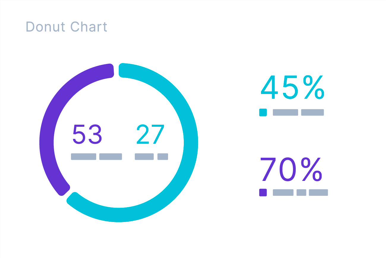
The donut chart is a visualization method in which the proportion of each part of the total item of the data is arranged in a fan shape and expressed as a percentage. It means the ratio of the central angle of each sector to the total, and it is often used when comparing statistical figures because the ratio of each item can be grasped at a glance. A scatter plot is a graph that visualizes the correlation between two continuous variables by placing one variable on the x-axis and the other variable on the y-axis. It is mainly used to understand the correlation according to the change of each variable. The bubble chart is a visualization method that expresses the value of data with the size of a round bubble. The bubble chart itself can only express the size of the data value. However, if the scatterplot function is added, the x-axis and y-axis variables and the resulting values of those variables can also be expressed, which is useful for expressing three-dimensional data.
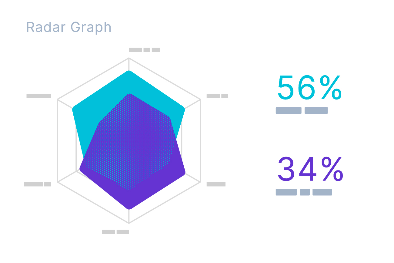
The radar chart is a chart that divides the circles according to the number of items and measures the scale at regular intervals from the center when there are multiple evaluation items, and draws points at the location according to the quantified value of each evaluation item and makes a line to see the balance between items at a glance. For example, in order to evaluate the quality of a specific product, it is easy to grasp the characteristics of the product at a glance if it is drawn as a radar chart by scoring points on design, price, convenience, and originality. It is also often used to express the abilities of game characters and athletes.
The frame diagram is a type of visualization method that displays hierarchical structures in the form of trees and is used to clearly express hierarchical relationships of data, and the funnel chart is used for the purpose of expressing at a glance how the indicator changes in stages. The Gantt chart is a visualization method that displays a timeline as a horizontal bar and is mainly used to organize a project and the schedule of the tasks included in the project.
Advantages of Data Visualization
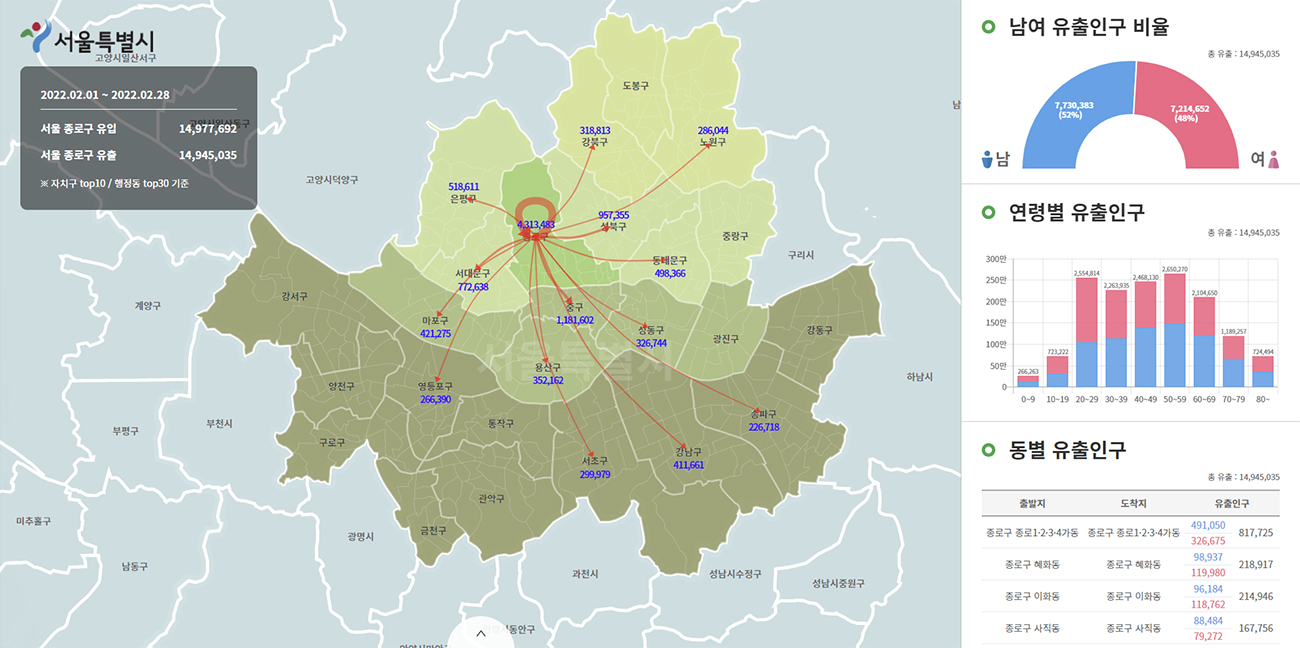
The first advantage of data visualization is that you can see a large amount of data at a glance. For example, if you look at the “population data of Seoul’s living mobility” in its raw form, it will be difficult to find a significant trend through the data as well as a vast number that cannot be reviewed. However, if you visualize this, even if you are not a data analysis expert, you can understand the population in Seoul at a glance according to various conditions such as time, region, and gender.
Another advantage is that data visualization can produce more accurate analysis results than summary statistics. In general, visual information is used for the purpose of “showing” the analysis results to others. Data visualization is not only for the purpose of simply delivering data analysis results, but also has high utility as a data exploration method for accurate analysis. In other words, visualization also plays an important role in
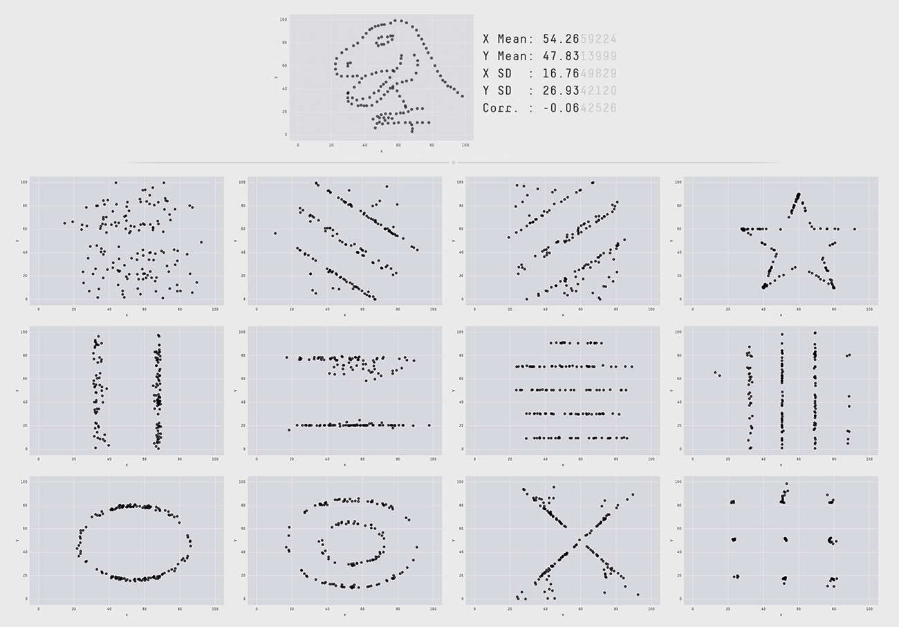
The figure above is a research case showing the difference between a Datasaurus (Datasaurus, a dataset that looks like normal stats, but looks like a dinosaur when visualized), a data set of Alberto Cairo, a famous person in the data visualization field, and 12 data sets with the same summary statistics based on two decimal places. Although the charts distributed in dinosaur form and the 12 below all have the same data with major indicators such as mean, variance, and standard deviation up to two decimal places, a completely different pattern appears when visualized by changing the figures below three decimal places. This conveys the message that statistics summarized in numbers alone have limitations in deriving the exact meaning of the numbers and that meaningful differences can only be found when visualized. These research results confirm that data visualization goes beyond simply summarizing the data and is also essential to providing insights to understand and utilize the data.
As mentioned earlier, data visualization draws insights during the data analysis process and helps many people to utilize the data by organizing vast amounts of data in an easy-to-view manner. Another advantage of data visualization is that it facilitates data-based decision making based on these characteristics. For example, visualization charts inserted in reports and presentation documents also serve as evidence to effectively support message delivery.
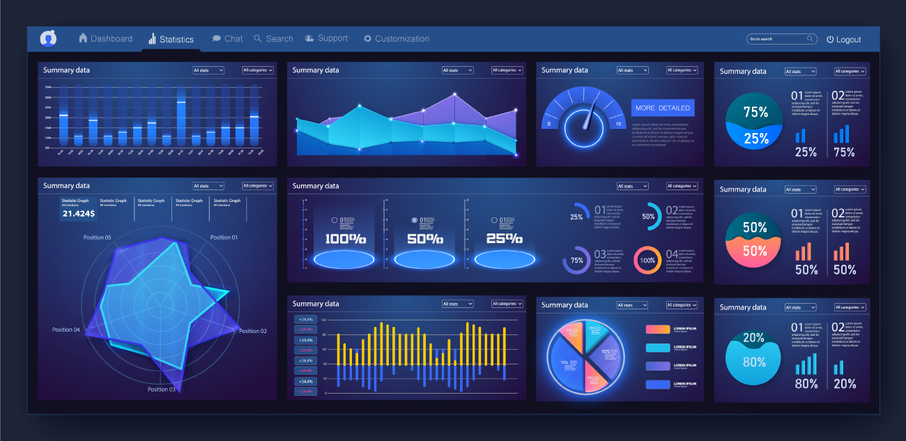
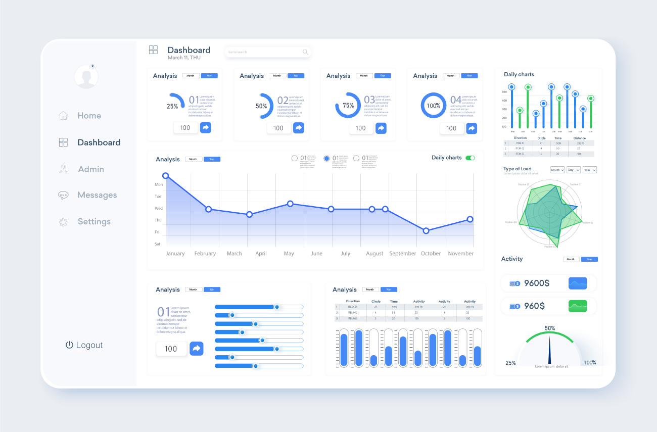
A representative way to share data visualization results is a data dashboard. A data dashboard consists of several visualization charts and tables and is used to monitor important data indicators. Most data dashboards provide an interactive function that allows users to select a data lookup period or filter data on specific criteria, allowing them to freely navigate data.
Thanks to these characteristics, data dashboards are very useful for businesses and organizations. This is because many organizational members can share common data dashboards and explore data from different perspectives to derive insights. In particular, since the data dashboard is composed of visualization charts, even if you are not a data analysis expert, you can utilize data usefully through various functions. Based on this, companies or organizations can find problems that have not been easily discovered and make important decisions based on accurate data.
Where and How to use Data Visualization?
Many companies are adopting data visualization to increase the utilization of their data. A data dashboard is being built and used for the purpose of tracking in-house performance indicators and activating data-based marketing. For example, the financial sector is increasing the efficiency of its work by making various data, such as a bank’s core management indicators, monitoring business performance by organizational unit, and analyzing unstructured information according to customer characteristics, not numbers. The press and media actively use data visualization to realize data journalism with an emphasis on data-based storytelling. They use visualization techniques to effectively tell a story to readers while increasing objectivity and reliability by creating content using data.
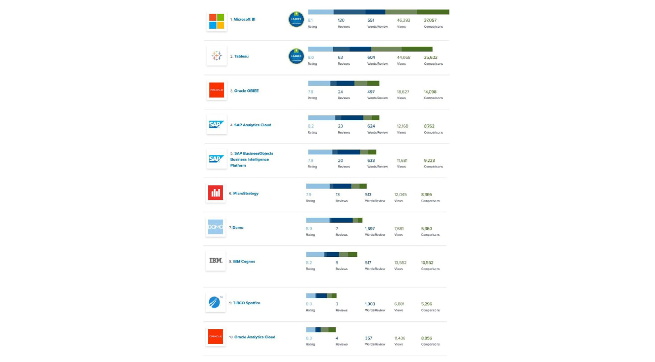
As the utilization of data visualization increases, various solutions have emerged that make data visualization easy for anyone to implement. Representative examples are Microsoft’s Power BI and Tableau. Power BI is useful for visualizing a variety of data sources because it provides more than 70 types of data connectors as a data utilization tool that allows you to access and view all your data anyway and anywhere at a glance. Similarly, Tableau provides various visualization functions so that anyone can easily access data visualization as a tool that visually analyzes complex data sources. In addition, there are various data visualization solutions such as Oracle OBIEE, SAP Analytics Cloud, Microstrategy, and Domo.
Hyundai Rotem’s Data Dashboard Use Case
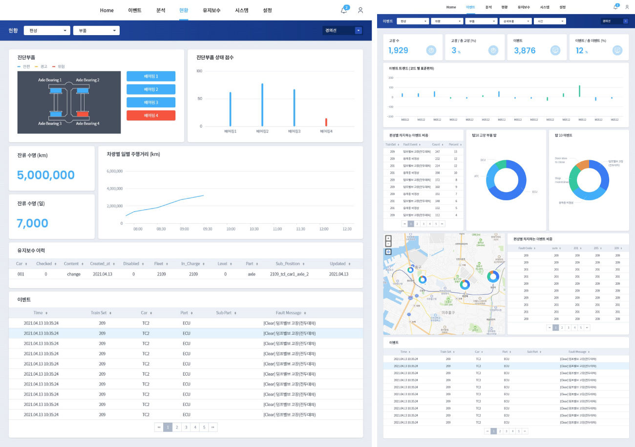
Since 2018, Hyundai Rotem has developed a big data analysis platform that enables condition-based maintenance (CBM) and predictive maintenance, which are part of smart maintenance using big data on trains. This platform has slightly different construction methods and utilization methods depending on the requirements of each project. There is a form of a big data analysis platform that focuses on the collection and analysis of sensor data of major systems, or a form of a platform that provides a more intuitive train status to operators through real-time monitoring and diagnosis. All of these platforms utilize the Internet of Things (IoT) technology to connect to various sensors and data collection devices, collect information on railway vehicles, analyze it, and take necessary actions immediately, so smart train operation and maintenance can be performed.
Data visualization and data dashboards have made it easy for administrators to identify and solve problems in this system. Numerous data collected in real-time from trains make it difficult to identify problems within a short period of time based on numerical values alone. However, this is an example of building a system to intuitively identify and solve problems through data preprocessing and visualization. For example, Hyundai Rotem can easily identify various data in the condition based maintenance system data dashboard, such as the result of the event of the diagnosis component, the score of the diagnosis component, mileage of train, remaining life of the diagnosis component, maintenance history of diagnosis component, the cumulative number of train failures, number of failures by system, failure rate by the fleet, TOP 10 analysis of failures, number of failures by location. Through the dashboard that visualizes the data, the manager can understand the current condition of the train based on the data and predict the possibility of a failure to provide a safe train use environment for passengers.
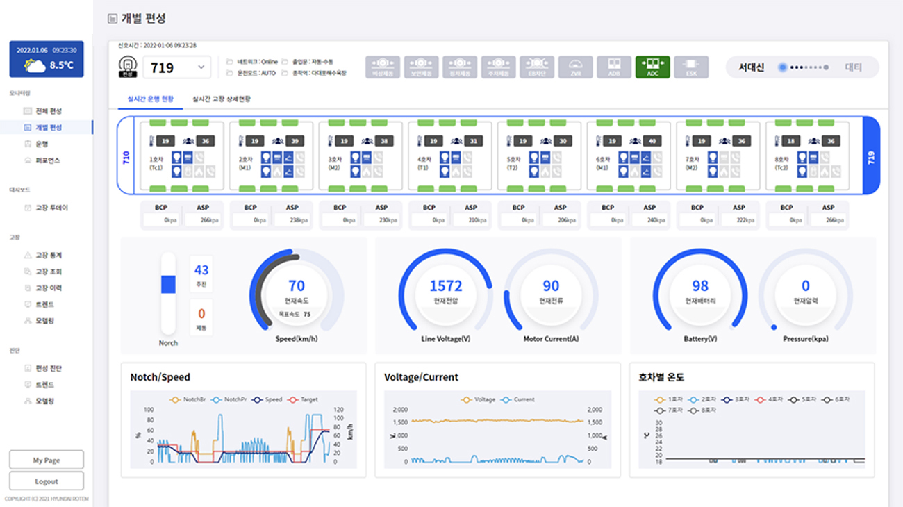
In addition to train maintenance, Hyundai Rotem provides insights to operators and maintainers to manage trains more efficiently through visualization to facilitate diagnosis by monitoring various data in the train in real-time. The train real-time monitoring diagnosis platform optimally manages the environment in the train by identifying real-time information such as the room temperature of the train, the number of passengers, flashing conditions, propulsion/braking commands, overhead voltage, battery voltage, and main air pressure through a data dashboard.

The existing data utilization method was conducted in the form of reading and analyzing scattered data one by one to identify problems and come up with solutions. This not only took time and effort, but it was also difficult for non-professional analysts to access. However, as the technology to collect and analyze data has developed and data visualization technology to effectively show it has become common, it has become possible to efficiently identify problems and make decisions quickly by implementing a vast amount of data on one screen.
In fact, overseas, in some cases, maintenance costs have been reduced by up to 30% compared to the existing ones by introducing a smart maintenance platform using data. Of course, these cost reductions are not all effects of data visualization, but the importance of data visualization is very high in that the final form of using data for decision-making is visualization. With the recent trend in which how to use data becomes more important than how to acquire it, interest in data visualization, a technology to value data, is also increasing.